CS3216 Post Mortem
Dec 8, 2013
I survived CS3216 and it wasn't an easy feat in my opinion, given that I spent almost half my time on CS1010S this semester, the other half went to CS3216. Would like to give a quick run-down of my experience in CS3216, something like a review. Oh yes by the way, the current module review site sucks, someone build a better one please.
CS3216 in General
This module has been FUN. Never have I built so many products within a span of a semester before. We had the freedom to do whatever we wanted in our assignments and final project, unlike other software engineering modules where students had to build to-do lists. However, this freedom and flexibility meant that the scope of the project depends on you. You can choose to simply meet the bare requirements or aim for the sky with a large-scale project. In my projects, my team(s) and I aimed to meet these three criterias: usable, polished, valuable. This is much unlike my past hackathon projects where I could only achieve polishness. A small, robust application that really works has more impact than an ambitious one that cannot be completed within the timeframe of the project.
CS3216 is a huge test of versatility and my versatility was stretched near its limits throughout the course. My roles in the various assignments and the final project:
- Assignment 1 (Facebook Assignment): Osmose - Front End Developer, UI Designer
- Assignment 2 (Facebook App Seminar): Tinder - Designer, Content Curator
- Assignment 3 (Mobile Web Assignment): Qivi - Front End Developer, UI Designer, Marketing guy
- Final Project: Una and Nutty Ninjas - Front End Developer, UI Designer, Creative guy, Marketing guy, Product guy and... Props maker
The final project really drained me out. I was wearing multiple hats and it was tough to juggle them. Shall go into further detail later.
Comparing with CS3217, it's hard to say whether CS3216 was easier or tougher. CS3216 and CS3217 were tough in their own ways, but one thing is for sure: It gets people addicted to these crazy software development modules and leaves them asking for more.
| CS3216 | CS3217 |
|---|---|
| 4 x Group Projects | Individual problem sets, 1 Final Group project |
| Product-focused, less on engineering | Engineering-focused, nice design is a bonus |
| More flexible curriculum and scope - build (almost) anything you want | More structured - everyone builds the same app in the Problem Sets |
| No hardware requirements | Requires a Mac, if not you'll have to camp at PL1 |
| Many students enter with existing web knowledge | Not many know iOS prior to the course |
Assignment 1 - Osmose
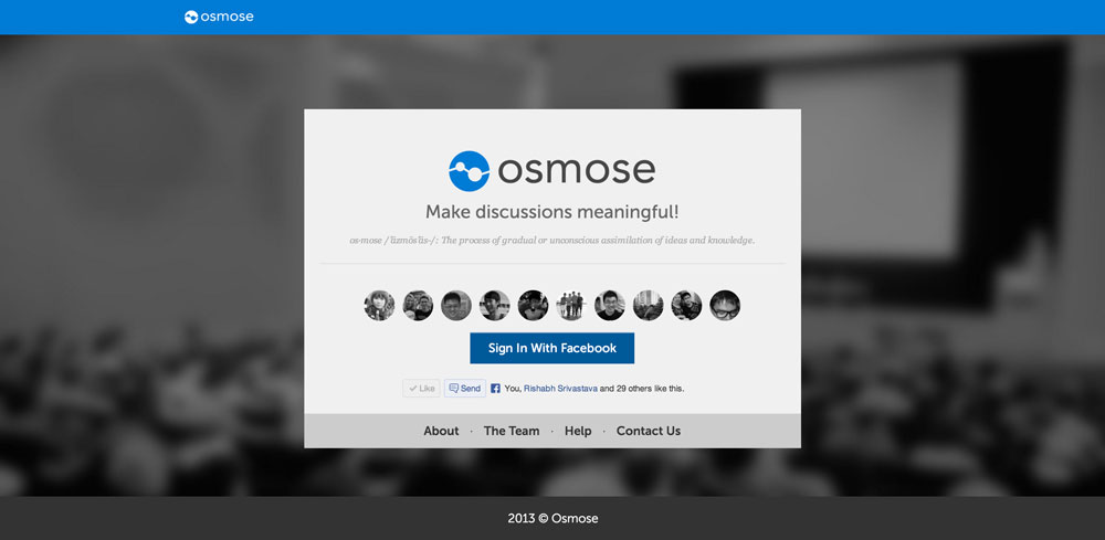
After working on Corspedia, and seeing a thousand hits a day during the CORS bidding period, I grew interest in creating school-related apps. After seeing the state of the CS1010S IVLE forums (we had a few hundred posts within the first two weeks of school), I had the thought of giving each module a homepage to organize the module-related questions integrated with real-time features, with the aim of promoting interaction among coursemates.
My teammates for this assignment were Soedarsono, Le Viet Tien and Soon Chun Mun, they are seriously among the best software engineers that I know in school. I proposed the idea of a StackOverflow x Disqus for NUS modules and the rest were agreeable with it. We knew each other's strengths and hence roles were assigned pretty quickly.
The name Osmose was chosen because I wanted to try naming a product after a proper English word/name. E.g. Path, Line, Amazon. Osmose also meant: The process of gradual or unconscious assimilation of ideas and knowledge. The theme colour of blue was chosen, because blue is the colour of water (osmosis).
Using sails.js, we got the back-end up in a snap, along with real-time sync features. Sad to say, I was the limiting factor in this assignment, because I spent the first a week and a half settling admin matters for CS1010S, and started on the front end work quite late. As we coded, we realized that there was no real need for sails.js, the 'magic' that sails did for its users wasn't really relevant in our case and we still had to write the complicated stuff ourselves.
Because we started on the assignment later than expected, we were rushing to hit all the milestones few hours before the deadline, all of us stayed in school till 12mn to make the final commit together :/
In retrospect, Osmose wasn't really innovative and there were many loopholes in the product design. We initially wanted to let CS1010S students try it, but after further thought, realized it still had a long way to go before it was good enough to replace IVLE.

Assignment 2 - Tinder
This assignment started after Assignment 1 and ended before it. A non-coding assignment, we had to analyze and critique a Facebook app and do a class presentation on it. We picked Tinder because it was a highly controversial app and would definitely interest many. Tinder is an app which can match people who are mutually attracted to each other.
My teammates for this assignment were Hendy Chua, Minqi Chen and Chen Liang, who were great presenters. There wasn't clear allocation of roles because the work required for this assignment wasn't too heavy. We came up with the content together and I designed the slides. Hendy gave great ideas on how to make the presentation funny and incorporated them into his content. For the first half of the presentation, Hendy made the crowd laugh with his jokes, while Chen Liang articulated the content well in the second half. This helped us score a decent grade for the presentation component.
Next, there was the blogging component where we had to blog about an app presented in class by other teams and also go around commenting on others' blog entries. This took up a lot of time as I went to read the posts by almost everyone in class. Crafting insightful comments also sucked up some time. A big thanks to my peers who took time to comment on my entry!
This assignment made me feel like a CNM student, with the amount of writing we had to do. But it was a good break from all the coding in Assignment 1.
Assignment 3 - Qivi
I believe most students in class disliked assignment 3. This includes me as well. I blogged about how much I disliked mobile web development in one of the previous posts. Although I hate to agree, but mobile is the future. This assignment had to be there. I proposed the idea of transforming mobile devices into clickers. A plausible replacement for current clickers, which are extremely troublesome to use. The app was named "Qivi" - The acronym for Question Instantly, Vote Instantly.
My teammates for this assignment were Zhixing Yang, Cheng Qing and Navie. Since they were back end coders, I was left to do the front end by myself. Project management for this assignment was quite bad... We only really started during recess week and everyday felt like a hackathon. Being the sole front end developer, I was also worried that I couldn't complete it in time.
Ultimately, we cut features and removed the option of answering open-ended questions. Not using any server-side frameworks caused the API to be inconsistent and more bug-prone. Sigh. But we managed to finish in the end, hitting as many milestones as possible. The end-product was still buggy, but done is better than perfect (lame excuse).
As there were two kinds of users for Qivi (creator and voter), it wasn't immediately obvious as to how to use Qivi. Hence I created a help page that demonstrated the flow of event creation and poll responding. A test event was also created. This walkthrough served two purposes: (i) Teach and show the graders how Qivi is supposed to be used. (ii) Guide the graders through a bug-free app flow so that the app appears less buggy.
The help page worked out and it's probably the reason why we scored extremely well for this assignment. But this doesn't change the fact that mobile web development is a big pain.
Final Project
The whole process can be broken down into a few stages: Ideation, Development, Refinement, Pivoting, Showcase.
Ideation
The ideation process for the final project was pretty different from the previous assignments. We were choosing between two paths: (i) Aim for many users or (ii) Be the coolest app during STePS. Well, they certainly aren't mutually exclusive but it would be hard to achieve both.
After some discussion, we chose the path of "being the coolest app during STePS" and started to think about how we could get more eyeballs during the event. Each booth gets quite a number of people visiting it, but there are only the 4 of us and a few computers. We would let many people slip by, given the limited amount of manpower and hardware we had. Hence, our product had to do the talking. Also, it would be ideal to allow everyone to try out the product at the same time. That would only be possible if the audience had a device of their own. Hence, the idea of a cross-display application where users can interact with in real-time, using their mobile devices.
These kind of applications are usually games. Dr Colin Tan and Su Yuen advised everyone against doing games for CS3216, for the obvious reason of the inability to product attractive art assets, which is crucial to the success of games. However, there are actually some kind of games that can be made by indie developers: minimalist games. These games are usually 2D, have a retro theme and have a flat design. After evaluating our resources and skills, we went ahead with the direction of building a game.
What game should we build that was reasonable, given our timeframe, skills that would also fit the style of STePS? We eventually decided on a console-style, top-down, ninja-themed multiplayer shooter game. Players would play the game by using their mobile devices as controllers on a shared display.
Development
We weren't exactly sure whether the idea of cross-display games would work out because of latency issues. Chun Mun was quick in prototyping simple demos to test the latency and they were surprisingly low. Soedar built a tank game using EaselJS to test the frame speed of the game while Viet Tien added a virtual joystick to test controller interactions.
We were satisfied with the results of our prototyping and were confident that the game would work fine. Together with my brother, we designed the assets and I developed the HTML for the non-game screens while Soedar, Chun Mun and Viet Tien worked on the game.
Refinement
When the first version of our ninja game was complete, we went around getting many of our friends to try. The general feedback from them was that the controller was hard to use and it was also troublesome to have to lock the orientation of the device before playing. Other feedback included giving a sense of purpose to the game by adding a leaderboard, monsters, and more flashy visuals. We took all these into account and made the necessary adjustments.
Pivoting
Two weeks before the showcase, we met with our mentors from LambdaMu games and they recommended that our product should be the technology behind the game and not the game itself. Dr Colin and Su Yuen suggested the same. We were quite apprehensive about it because a library would not attract as many people as a game would. Also, there wasn't much time left to build another product.
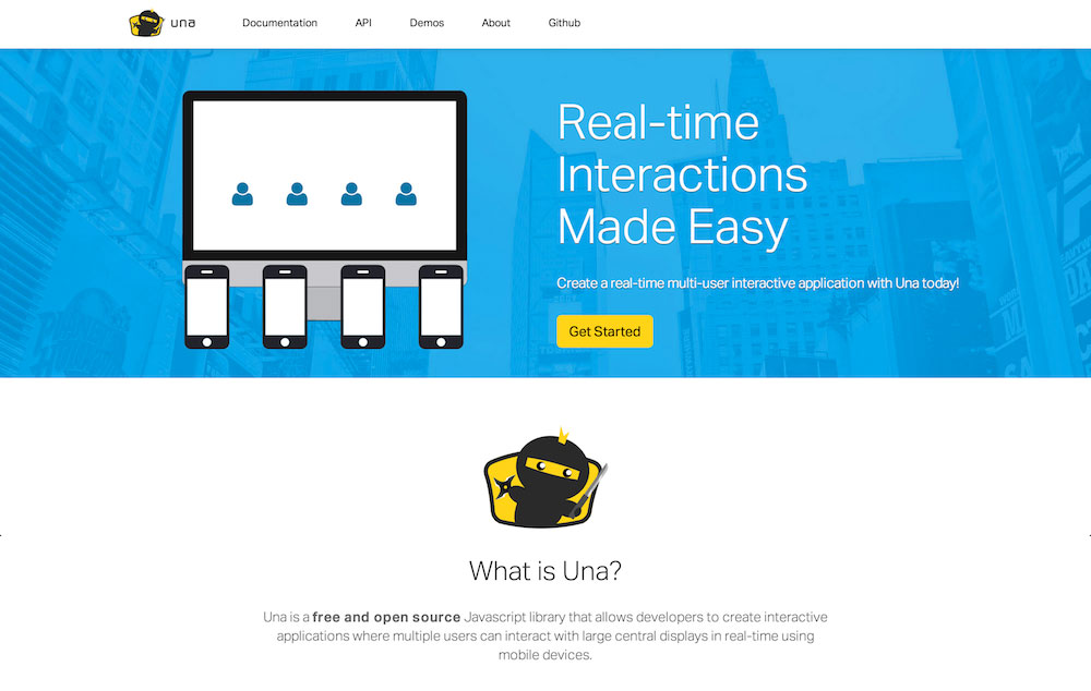
However, Soedar was confident of writing the library. We decided to give both the library and the game equal emphasis. Soedar completed Una, the library for writing cross-display applications, within 2 days. It's even live on npm registry right now! I proceeded to create a marketing site for Una. Within a few days, our library was live.

Showcase
With everything in place, it was the time to embark on the final phase of the final project: preparation for STePS. We wanted to excel in STePS and hence we put in a tremendous amount of thought into designing our booth, our product, and our showmanship. The amount of milestones we wanted to be met by STePS day was insane. We kinda brought it onto ourselves (or rather, I coerced the rest into it).
We put ourselves in the shoes of a participant at a conference. What would catch the attention of a person who was surrounded by tons of booths and posters? We definitely needed flashy visuals and publicity. A good way to attract a crowd was to have a crowd in the first place. We made it super simple for participants to try out our flagship game, Nutty Ninjas, just by using their mobile phones and accessing a web page. To garner more eyeballs, we requested for projectors and screens. However, we got a room (SR3) to ourselves instead! Having a room was a double-edged sword because we were separated from the rest of the CS3216 booths and people may not notice us.
To solve this, I designed and printed many attention-grabbing posters, and we pasted them at the entrances of SoC, to direct people to SR3. Friends and family were invited to come down to visit our booth. We opened the doors of SR3 wide such that people would know that there was actually a booth inside SR3 and they would perhaps pop in and have a look.
Great thoughts also went into the way we pitched Una as a library that is capable of much more than just gaming. It is a library that is capable of changing the way people interact with websites.
Viet Tien reminded us about network issues causing some CS3217 projects unable to be demonstrated. That would be disastrous if it happened to us. Hence we formulated a backup plan of using our own router to create a local network in the event that the wireless networking in SoC failed and we could not rely on the school network for the demonstration.
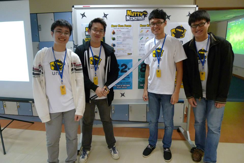
To look more professional, we printed t-shirts and I made nametags for everyone (:
On STePS day, the crowd was amazing! Many were impressed by the concept and requested for our contact details. We barely had any time to eat. Most of our time was spent explaining Una and teaching people how to play Nutty Ninjas.
6 weeks, 4 people, 3 products, Best Project. We made it (:
